
RetailMeNot
Mobile Couponing
Overview
RetailMeNot, Inc. operates the world's largest marketplace for digital coupon offers.
As RetailMeNot and its offerings have grown, additional information has been identified as potentially relevant to consumers on the offer pages. My project was to ideate and create mobile web designs to complement the desktop coupon, sale, printable, and product offer experiences. In addition to this, I was asked to identify anything that might be relevant to change on the desktop experience. Please note that RetailMeNot does not offer a responsive experience, so mobile and desktop pages are designed separately.
My Role
Worked on: Business analysis, user journeys, information architecture, prototyping, usability testing
Tools used: hand drawing, Sketch
Discovery
To begin the project, I worked with my UX mentor to take inventory of the different types of offer pages that were used in the RetailMeNot mobile environment. During this process, we also recorded what information was available on each type of offer page, as different types of offers displayed different information.
In addition to this, I completed a cognitive walkthrough of the coupon redemption process to fully understand any potential process breakdowns or confusion that might occur with users.
During this phase, we also worked with our product manager to brainstorm new elements to potentially include on the redesigned offer pages. With additional elements, we hoped to prolong a user's time spent on the RetailMeNot site, or get them to return post coupon redemption.
Design
Information architecture
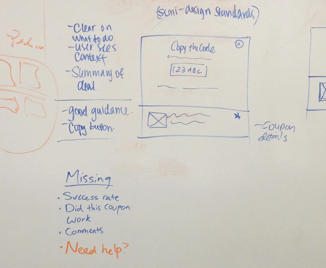
Now that we knew what data was available to be included on each offer page, we needed to determine the hierarchy of where on the new offer page each element should live. The elements we initially decided to include were:
Store and logo
Offer title
Offer expiration
Offer success rate
Social proof (comments, code usage number, verified or not)
Download the RetailMeNot app prompt
Links to share the offer with friends
Products users have purchased with offer
The code
Link to store website
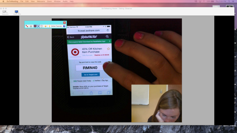
Instructions on how to copy the code
Offer details (how to use and limitations)
Wireframes
Due to conflicting views between the design and business teams on what elements were most important to highlight, I made three versions of the hierarchy with different combinations of business/user need prioritization. The design team presented the options to our product manager and discussed the benefits and shortcomings of all three. At the end of our discussion, we decided that Version C would move forward as the challenger to the current design during usability testing.
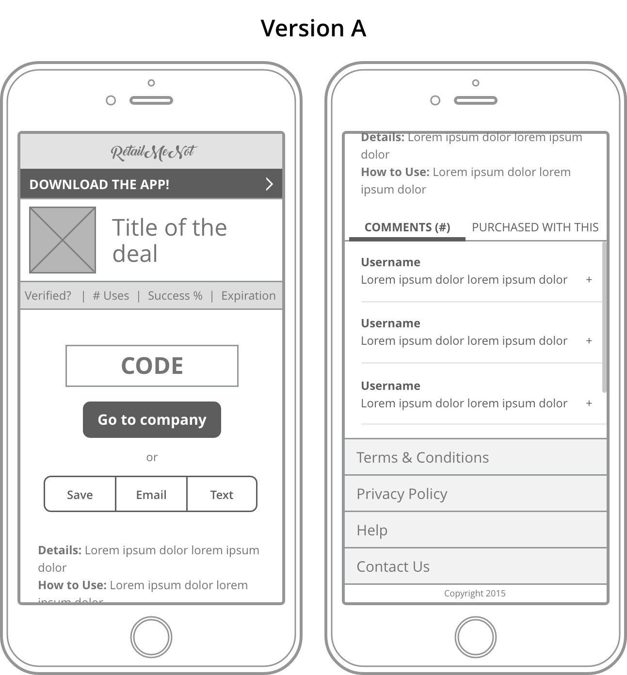
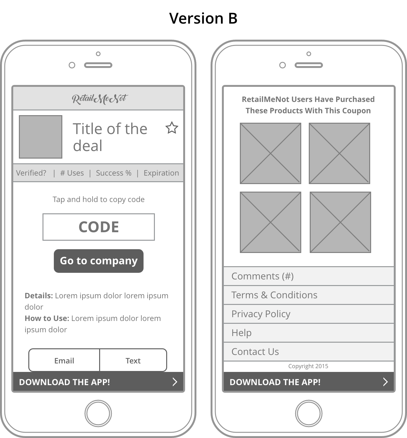
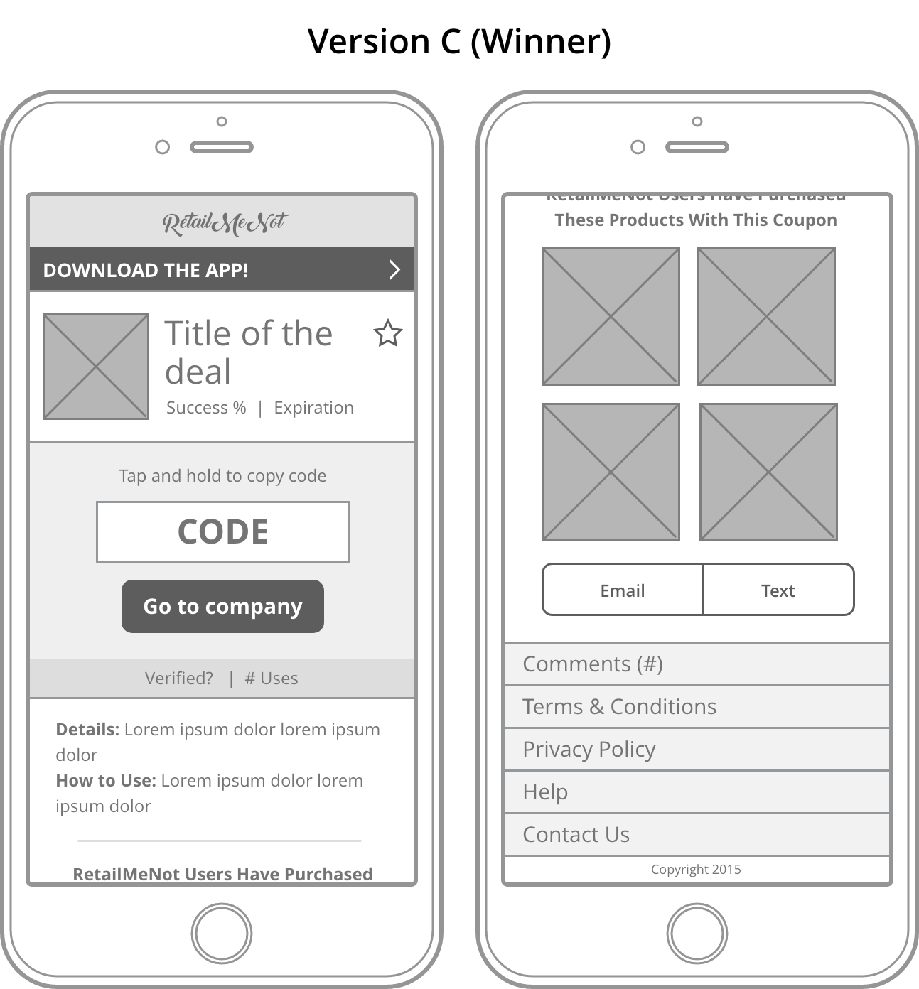
Once we had agreed on which design to put into testing, I utilized RetailMeNot's updated style guide to build the high fidelity wireframes that would then be used in the Axure testing prototype.
Current Offer Page
Proposed Offer Page
Usability Testing
Testing Methodology
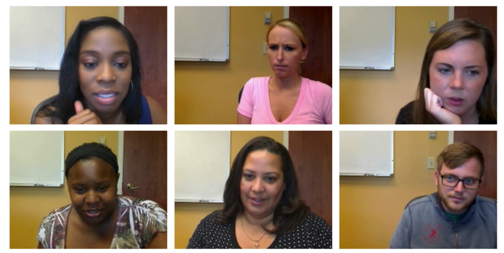
Six one-on-one usability interviews were conducted on July 30th, 2015 in Rochester, NY. We utilized RetailMeNot's preferred usability moderator to host these sessions but provided the test plan, prototype files, and asked follow-up questions as the sessions were running.
Participants utilized their own iOS devices for the sessions and for each task we randomly chose whether they would complete it first on the current mobile experience or the redesigned experience so as to minimize a learning bias.
Capturing Feedback
Participant behavior and reactions were captured using a forward facing webcam and an above-head camera was used to capture actions made on participant's iPhones.
I also took notes during the session to capture completion rates, time spent on tasks in both the current version and proposed, as well as
Findings
WHAT WORKED?
New design is "cleaner" and "prettier" than the current
6/8 participants commented on the fact that the new design had a cleaner/more appealing look than the current design.Instructions on how to copy the code were helpful
All participants were able to copy the code from the new design an enter it into the Target website. 4/8 participants actually read the "Tap and hold to copy the code" prompt to themselves out loud.Surfacing both percent of success and number of uses today above the fold helped sell the coupon
When prompted, participants said that seeing two forms of social proof was helpful in deciding to try the code.Attaching the "Save" functionality to the coupon title was intuitive to users
All users said that they preferred saving the coupon at the top of the page and with the coupon title rather than having to scroll to find the saving functionality
WHAT NEEDS IMPROVEMENT?
Incentivizing users to return to the offer page
No users returned to the offer page after they input the code on Target's website. Only one user scrolled the page to see suggested products before copying the offer code. When prompted to return to the offer page to explore, users said they wouldn't do so in the wild unless there were listings for similar deals.Expiration countdown
Users were split on how they felt about this. 5/8 participants said that this was helpful to them as they generally only looked for offer codes when they were about to complete a purchase. This countdown most likely would spur them to finish a purchase they might have otherwise been on the fence about. However, 3/8 users said that they saved coupons to use later rather than only looking at the time of purchase. They felt that the countdown was distracting and one user commented that it made her feel "antsy" and "pushed into purchasing something NOW."Verification means nothing to users
All users said that a coupon being marked as "Verified" meant nothing to them. They felt that success rate and number of people who had used the offer code meant more to them.