How do we make research more accessible and engaging for our clients?


Client

Redacted

Role
Product Designer & Researcher

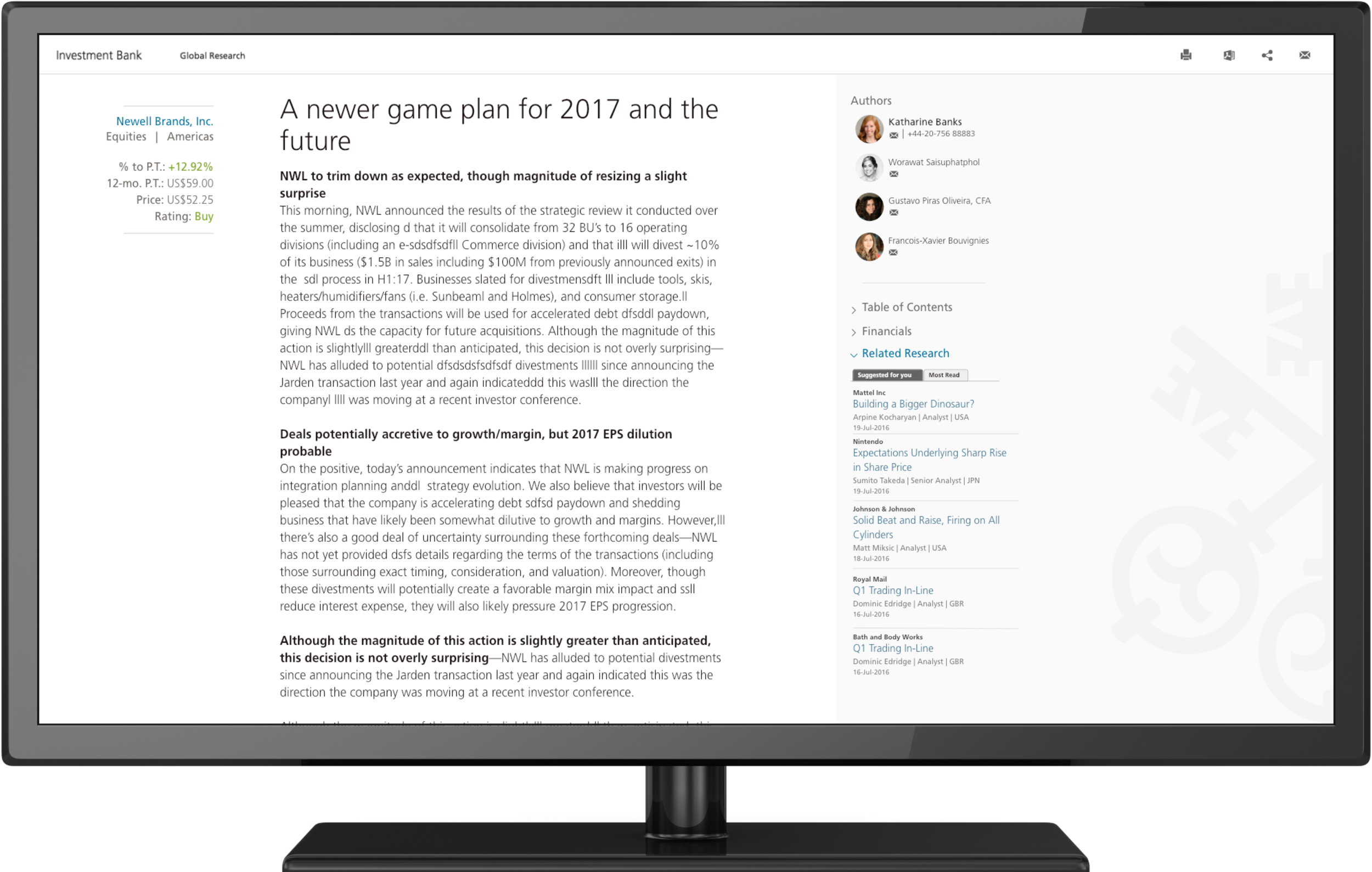
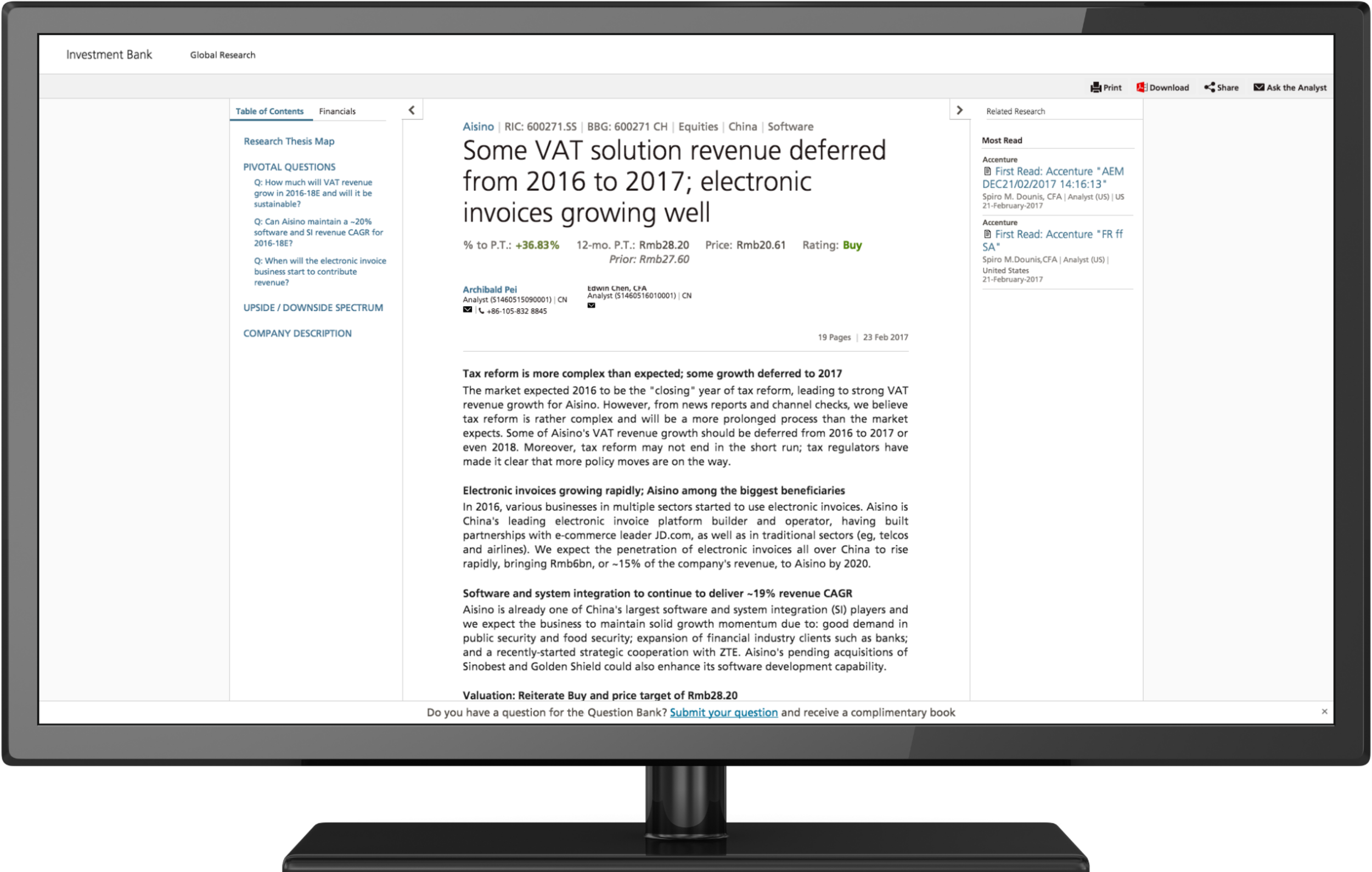
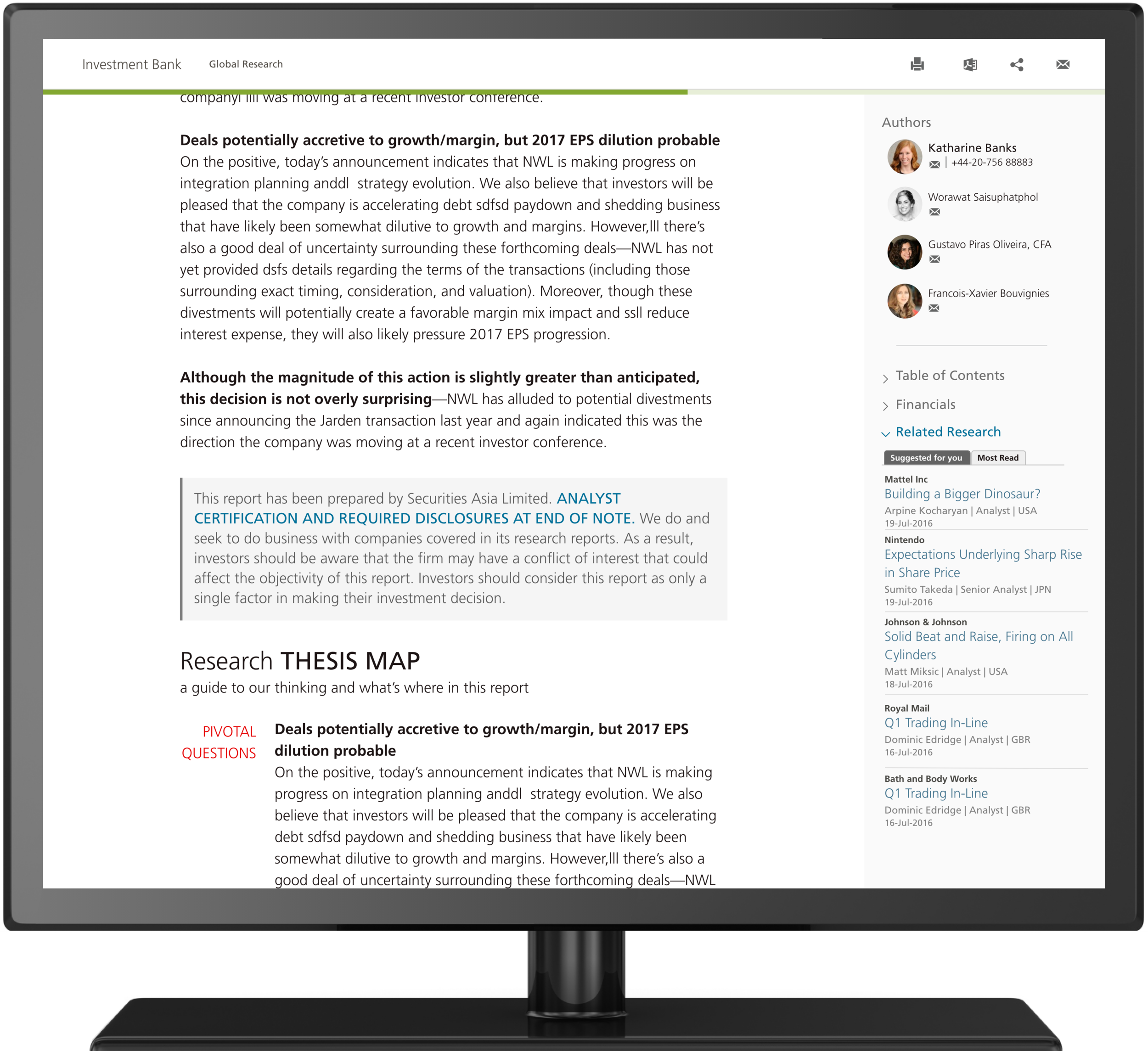
For the past few years, investment banks have been making a shift towards presenting research in the form of HTML rather than solely through PDFs. Not only does this shift make research more easily accessible from any device, it also gives banks the opportunity to collect data on how clients consume research and then tailor that research to them.

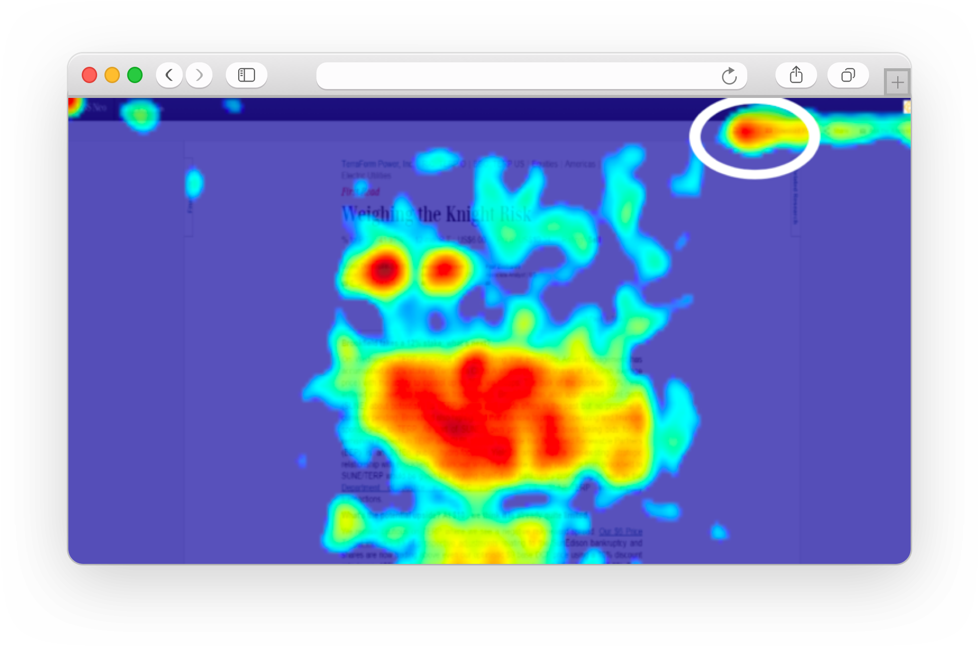
When I was hired onto the team, I noticed a few issues with the HTML design that not only went against universal design patterns, but also what I knew of how clients interact with research. 

DISCOVERY

looking to the past

To understand why our HTML research renditions were created the way they were, I turned back to the design documentation from the original designer. I found that no exploratory interviews were held with clients (or members of the sales team, whom we often use as proxies for client interviews.) Instead, designs were made purely based on input from the business side. Emphasis was put on showcasing as much information as possible on page load with little regard to what information clients felt was most useful or even how they would use it.


Digging for data

I knew that in order to sell the necessity of design tweaks to a relatively new product I would need to come armed with data. I worked with the Director of Analytics to get element click rates, scroll depth heat maps, as well as session duration statistics on the current HTML research and then used this data to guide my user testing plan and later on, the redesign. 

 
head map browser.png

From this data, I learned that

01.

The most commonly clicked elements were the print button, and analyst email links

02.

Research generally “went cold” at the first legal disclaimers

03.

67.2% of users closed the sidebar within a minute of landing on the page


Understanding legality

During this data gathering process, I also met with the Global Research Risk Manager to understand compliance rules around presentation of disclosures and disclaimers. Through examining hundreds of heat maps, I found that the majority of documents went cold at the beginning of the global disclosure even though this point on the page was not the end of the document. 

I also noticed that the previous designer's styling of the global disclosure area was very similar to the design pattern many companies used to signify the end of their articles/the beginning of their comments or similar stories sections.  I wanted to fully understand the company's legal obligation for disclosures before I changed this pattern or its position and designed something that went against regulations.

disclaimers.png


"user" Interviews

As previously mentioned, in the majority of cases the product team does not have access to clients, so we use salespeople as proxies for interviews. I set up interviews with 15 equity salespeople and asked them to detail what they knew of client reading behavior and what type of information they were most frequently called and questioned about. From this, I learned a few key pieces of information that I would later incorporate into the new designs:

01

Clients take analyst's buy/sell/neutral rating as a guideline

They care most about the supporting evidence so that they can make their own calls. They want to get to the analyst's point quickly without having to sift through "useless" information that does not help them make their own judgments on a stock or sector.


02

Clients want their recommendations customized

Clients want additional research recommendations that are tailored to them and their interests, not just a list of most read research that may not apply to them.**


DESIGN

WIdescreen desktop

After understanding as much as I could about why the design was as it currently stood as well as how users interacted with the current design, I began making tweaks. 


Regular desktop


Tablet


Phone