robot.png
 

How can we make investing accessible to more people?


Client

Morgan Stanley

RoleS

Product Designer / Product Design Lead

WHAT IS THE PRODUCT?

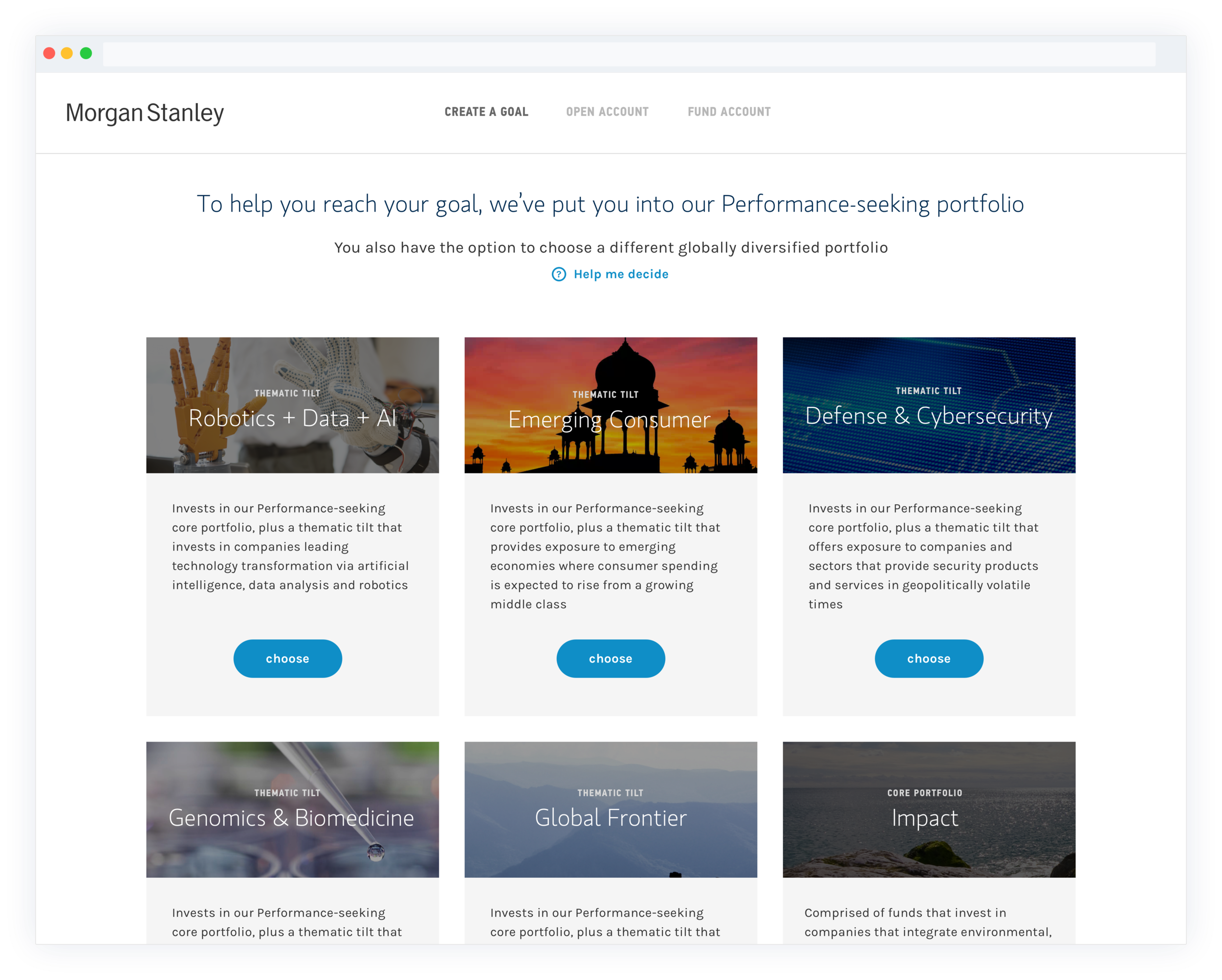
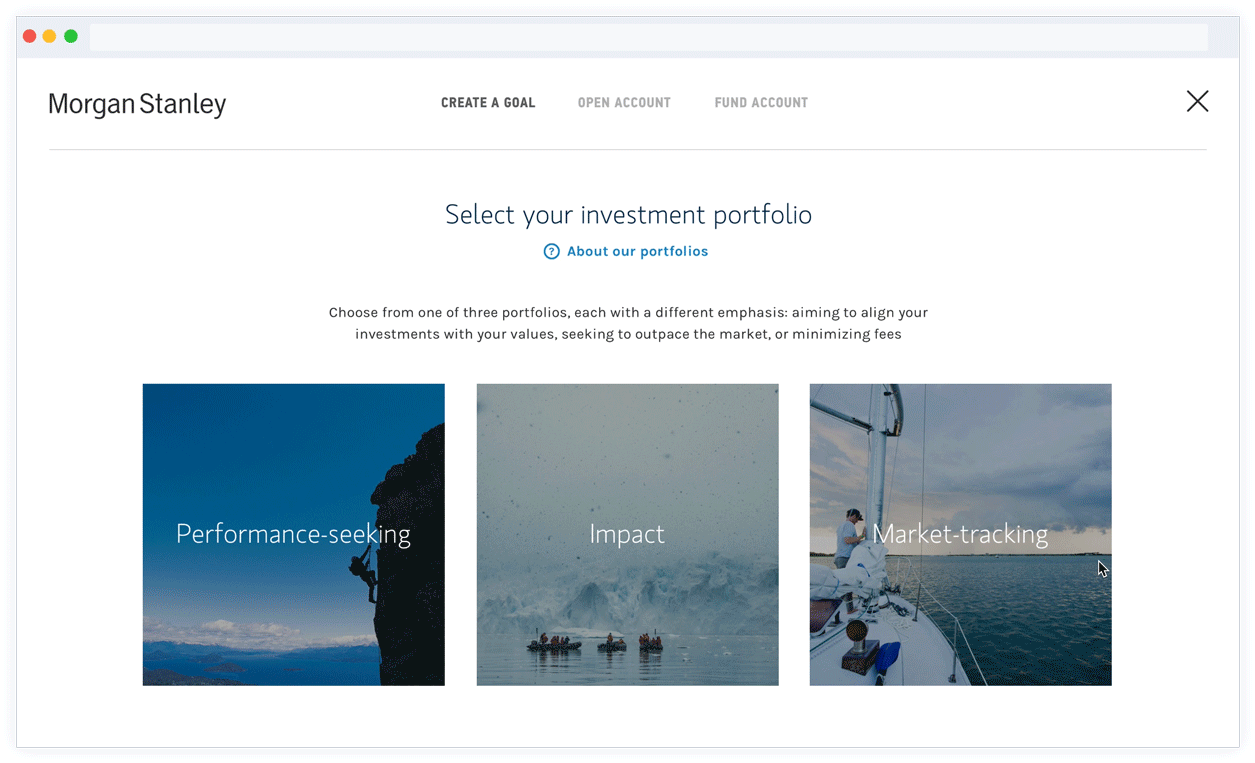
Access Investing is an online investing platform designed to help build, monitor, and automatically rebalance a diversified portfolio. Access Investing provides investors access to easy-to-use, low cost, high quality portfolios backed by the investment expertise of Morgan Stanley.

SETTING THE STAGE

When I was brought in at Morgan Stanley, Access Investing was two months from the pilot launch. An outside agency had done the bulk of the design work, with an internal designer overseeing.

While we eventually moved away from the agency and I becameI eventually, this case study will focus on a specific element within the product’s onboarding flow that received many rounds of iterations and testing.

This will give a sense of how

1.0

DATA GATHERING

Since no usability testing was done on the product before the pilot release, we relied heavily on analytics and pilot user feedback to begin pinpointing problem areas. The pilot ran for three months, and within that time we gathered click metrics, session times.

The theme/tilt selection process was the second highest dropoff rate (after creating credentials)

The theme/tilt selection process was the second highest dropoff rate (after creating credentials)

The theme/tilt selection process was the second highest dropoff rate (after creating credentials)

The theme/tilt selection process was the second highest dropoff rate (after creating credentials)

The theme/tilt selection process was the second highest dropoff rate (after creating credentials)

The theme/tilt selection process was the second highest dropoff rate (after creating credentials)

Once we had this data, the Lead Designer at the time and I began making our hypothesis as to why these bits of data were happening. We translated these hypothesis into design changes that I then prototyped in Axure to take into usability testing.


2.0 USABILITY TESTING (ROUND 1)

I worked with a member of our UX Research team to put together a test plan that focus on blah blah lorem ipsum blah blah.

WHAT WE LEARNED

1. In the production version, test participants did not understand the difference between a thematic tilt and a core portfolio

Blah blah blah small explanation of what this is. User’s did not understand what we automatically selected for them as well as.

If you look closely, you can see that the Impact tile has a “Core Portfolio” tag, while the others have “Thematic Tilt” tags

If you look closely, you can see that the Impact tile has a “Core Portfolio” tag, while the others have “Thematic Tilt” tags


2. The redesigned version was still too “busy”

Test participants indicated that while selecting an overarching portfolio was clearer, they still felt overwhelmed when choosing an optional tilt.

Gif.gif

Specific things we identified were:

  • We also noticed that when we prompted participants to change their overarching portfolio, the majority clicked the browser back button to do so. When we dug deeper into why they did that rather than utilize the controls on the left side of the screen, they said they’re just used to hitting back to change details. When it came to a tradeoff of having to click back vs. having that freedom of movement on the page (but making the experience busy) — they’d rather have clear direction forward rather than the ability to change their mind on the screen at the same time.

  • The term “No Investment Focus” makes it sound like Morgan Stanley is randomly investing for you, rather than you have made the choice to have no additional investment tilt on top of your original portfolio choice.


3.0 DESIGN

WHAT WAS THE GAME PLAN?

Going into the third iteration


WHAT TO CHANCE

As we had the feedback, blah blah blah

  • Just move them forward
    Once a user chose a portfolio, they needed to use browser back to go back

  • Explain, explain, explain some more
    All participants were able to copy the code from the new design an enter it into the Target website. 4/8 participants actually read the "Tap and hold to copy the code" prompt to themselves out loud.

  • Set expectations of what a tilt is, even without the help drawer
    When prompted, participants said that seeing two forms of social proof was helpful in deciding to try the code. 


4.0 USABILITY TESTING (ROUND 2)

WHAT TO FOCUS ON

Six one-on-one usability interviews were conducted on July 30th, 2015 in Rochester, NY. We utilized